Hochschule Fresenius
Areas: UX/UI design
Tools: Figma
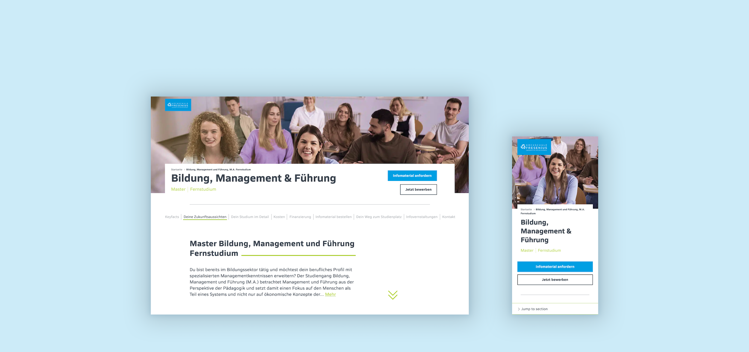
Hochschule Fresenius is an established private German university. I was approached by the Fernstudium (distance learning) unit to create new designs for their home, product, and landing pages.
Overview
Keeping the global typeface, colours, and buttons, I stripped everything else away to create a more “grown-up” version of the website which would inspire trust and prestige in users interested in higher education.
I gave everything a complete overhaul, prioritizing efficient use of space and user friendliness.
The first problem was apparent on load: needlessly large product page hero, taking up so much of the screen that no information was visible in the viewport besides the study programme name.
Identifying the problems
This misuse of space was a recurring problem, resulting in a lot of unnecessary empty space and massive page sections—the lead form, for example, took up more than 2 viewports.
There were UX issues across the website, such as the wall of text in the first section of product pages or the un-anchored navigation, rendered useless after the first jump.
Another big issue was that all the headings were set to all-caps, giving the user the feeling they were being screamed at. On top of that, very bright colours were used as body text backgrounds, causing eye strain and lowering readability.
Elements were laid out and reused inefficiently, leading to information being hidden without any space being saved.
Accordions especially were heavily used across the website.
The Infoveranstaltungen section linked out to individual information pages for each event; these pages, however did not have the content or purpose to warrant their separate existence, as registration was done on another separate page.


